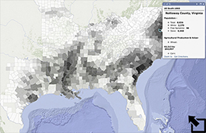
The forced migration of African Americans did not end in 1807 with passage of the Act Prohibiting the Importation of Slaves and the end of the legal slave trade into the United States. The expropriation of native American land in the southwestern United States in the early 1800s, coupled with the growth of the cotton and sugar economies in these territories saw both a growing black market for slaves from the Caribbean and an overland trade in slaves from the southern Atlantic States - particularly from Virginia and Maryland. This overland trade has been characterized as slavery's Trail of Tears.1 Over one million slaves were sold from their homes and families by owners in the coastal states and were forced south and west in the years from 1807 to 1860 and the start of the Civil War. The growth in the number of slaves in the new South and the relative decline in the states of the old South is evident in the graph and map below.
1) Explore the Slave
Population graph above. Which states saw the most
dramatic increase in slave population from 1830 to 1860? Describe
what happened to the percentage of slaves in these states over the
same period of time.
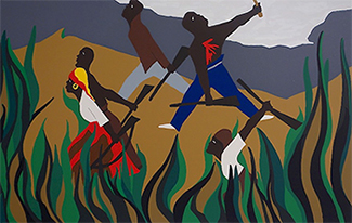
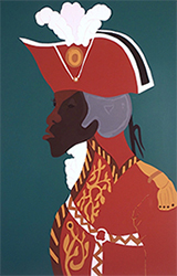
2) Slaves made up almost 90% of the Haitian population prior to the successful 1807
slave revolt led by Toussaint L'Ouverture. How do the
slave states in the American south compare in this regard?
3) The initial views for each decade in the Slavery Map show the concentration of the slave population
in each county. Begin with the Southern States 1790
layer and open each layer successively thru 1860. Describe the shift
in the concentration of the slave population over time.
4) During the 1700s tobacco production was concentrated in the
region around Chesapeake Bay. Examine the agricultural data
available for 1840 and 1860. Change style (  )in these
layers to show the number of pounds and value of tobacco produced in
counties throughout the South. Describe the patterns you notice.
5) Perform a similar analysis for sugar and cotton.
6) Change style (  ) once again and map both the value
of tobacco produced and the number on nonwhite slaves in 1840 and
1860. Do the same for the value of cotton produced and the number on
nonwhite slaves. Compare and contrast the results.
slave population data from U.S. Census Bureau (1860). "Table 60. Number of Slaves," Vol XIV, Statistics of Slaves. Downloaded Dec 3, 2016.
Last modified in March, 2024 by Rick Thomas
