The effects of the famine on the Irish population
were catastrophic. The country's population declined by over three
million between the census years of 1841 and 1851.1 In County
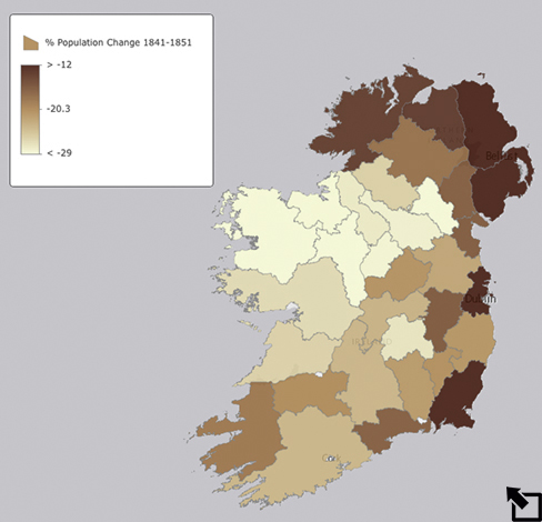
Mayo alone the population decline was over 29%. Approximately one
million Irish died as a result of starvation and disease during the
famine years. Over two million emigrated - mostly to North America.2
As you can see in the map at the left the impact of the famine on
population varied by county. County Dublin actually saw a population
growth of about 9% - most of the population being concentrated in the
city of Dublin itself where migrants from the countryside had fled in
search of work.
The impact of the famine was felt very differently across social and
economic class as well as geographically. You will explore these
differences in the activities below.
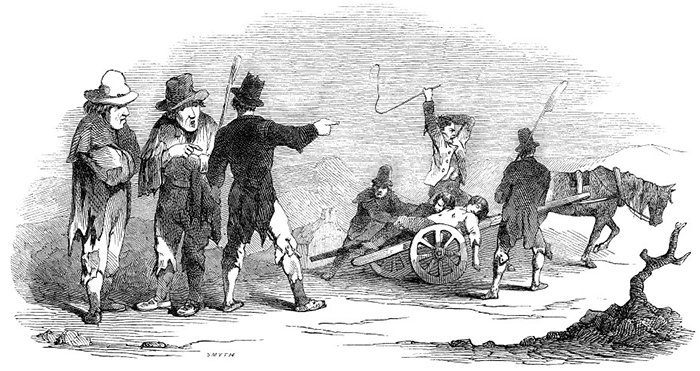
The article that accompanies this drawing of a funeral in Skibbereen, County Cork in southern Ireland from the Illustrated London News in January, 1847 notes that this was "no unusual occurrence." Death from starvation and fever were literally everywhere. However, death was not evenly distributed among the population. Nor was the ability to flee the famine by emigration. Different segments of the population in different regions of the country fared very differently.
Geographers Stewart Fotheringham, Mary Kelly and Martin Charlton argue that there are a number of demographic factors that can be examined that allow for better understanding of the effects of the famine.3 Among these they include:
- population density
- percentage of crop acres under potatoes and oats
- farm size
Data related to these topics is included in the Irish Famine map . Open and use the map as you address the questions below and build for yourself a picture of the famine's impact.
1) Recreate the map at right showing the percent change in
population from 1841 to 1851. To do this select to change Styles (  ) using Counts and Amounts (Color) to
show the % Change 1841-51 field. Describe any
patterns you see that show where the population loss was greatest
and least. Which counties were most dramatically affected?
2) Create a similar map to describe the change in population in the
decade from 1851 to 1861. Was the same pattern of change apparent?
Were the same counties affected?
2) Create a similar map to describe the change in population in the
decade from 1851 to 1861. Was the same pattern of change apparent?
Were the same counties affected?
3) Population density is normally measured as the number of people
per unit of area (square mile, acre, etc). In the case of the data
you have in the Famine map, though, population
density is given as the ratio of population to total acres in crops
giving a better sense of the ability of the available land to feed
the population. Create maps showing the population densities in 1841
and 1851 and discuss where the densities are greatest and least
and any changes over the decade of the 1840s.
4) Which counties in Ireland have the largest and smallest
percentage of the land in agricultural use? Compare the Acres
in Crops 1851 divided ( or normalized) by the Area
Acres of each county. That is, find the percentage of the
area of each county that was devoted to agriculture in 1851. How are
the results in this map correlated with the 1851 population density
map you created in #3? Does the relationship tend to be positive -
the same counties shaded similarly in each map? Or is it negative -
counties tending to be shaded in opposite patterns? Explain what
this relationship means in terms of the effects of the famine in the
counties across Ireland.
5) Farming in Ireland at the time of the famine had been bound
within a system of landlord-tenant relations since the English under
Oliver Cromwell conquered Ireland in the early 1650s. Lords had been
awarded large tracts of lands. They then leased their land in return
for payment in kind or currency to individuals who may have further
leased land down several levels to the point where those at the
lowest level may have had less than an acre of land to farm and both
pay their rent and feed their family. The size of the farm an
individual worked can therefore be used as an indicator of their
social level. Map the % of Farms Under 20 Acres 1851
in the counties across Ireland and analyze the relationship between
this variable and the others you have examined above. Make a similar
comparison involving the % of the Population in the Worst
Housing 1851.
image from "Mortality in Skibbereen,"from
Illustrated London News, December 22, 1849 as found
at Views
of the Famine
1 Cormac O'Grada, "Mortality and the Great Famine," in
John Crowley, William J. Smyth, and Mike Murphy eds. Atlas
of the Great Irish Famine (New York: New York University
Press. 2012.
2 Kerby A. Miller, "Emigration to North America in the
Era of the Great Famine, 1845-55," in John Crowley, William J.
Smyth, and Mike Murphy eds. Atlas of the Great Irish Famine
(New York: New York University Press. 2012.
3 Stewart Fotheringham, Mary Kelly and Martin Charlton,
"The Demographic Impacts of the Irish Famine: Towards a Greater
Geographical Understanding," in Transactions of the
Institute of British Geographers, 2012.
Last modified in April, 2024 by Rick Thomas

