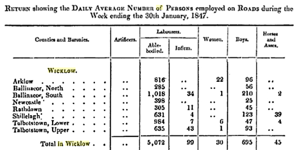
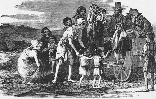
Elizabeth Smith was the Scottish wife of the
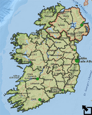
English landowner, Colonel Henry Smith, of Baltiboys estate in
County Wicklow. Her extensive journals reflect a rich mix of
personal perspectives on the management of their estate, the care of
those the estate supported, the famine, the Irish people, and the
various relief measures considered and enacted by Parliament.
March 7, 1847 - ...The relief works are to cease as
soon as the roads now in process of amendment are completed. What is
to be done with that immense army of disbanded workmen is not known.
The Government measures are not as yet fully developed. Some new Irish
poor law bill has passed the Commons but we don't yet know its
details, nor is the Loan to proprietors for Improvements yet ready to
be acted on. The terms however we understand; principal and interest
will be paid up in twenty-two years at the rate of £6. 10. 0 per annum
for every hundred pounds borrowed; estates to be liable for debt as a
first claim on them. Whether part of the improvement will be allowed
to be buying out of the small holders we do not know; if it won’t we
must borrow privately for this purpose as they can’t stay and we can’t
wish they should. Cairns has found this out; he yesterday gave up
possession to the Colonel of his house and farm; his house is restored
to him for the present till he can arrange his plans; he wishes to
emigrate to America and the Colonel is to assist him——with twenty
pounds but perhaps a little more. The poor man has gone up to Dublin
to make his enquiries carrying up a letter to John Robinson who will
direct him and gather for our benefit all the information possible upon
the subject as probably others will follow this wise example ….
April 8, 1847 - Very stormy weather, not doing any
harm however; nothing was forward enough to be injured by cold or wet.
In this Poor Relief Bill which as yet we have not seen there have been
two clauses inserted by the Member for Dublin, Mr Gregory, one of
which precludes the holder of more than a rond [quarter acre] of land
from being in any way assisted. This has set my mind at ease about the
Ratcliffe mountains; the hordes of beggars there are all small farmers
so we need not dread their numbers. In fact the name of relief to the
extent proposed is all that there is to fear; the paupers of Ireland
are not the labourers; they struggle on in their own miserable way as
well as their low state of habits and feeling admit of, there are
hardly more of them than are required even now, under this idle system
of husbandry; there would not be enough were the land properly
cultivated. The beggars are the small holders, entitled to no relief,
and so we shall gradually get them; they must give up their patches
and take to labour. I am anxious to see the Bill for I feel pretty
sure its provisions are in main good and that the Colonel’s anxiety is
causeless. Townland division would have been more just than Electoral
but there are clauses, I understand, to protect the conscientious. It
will very hard upon us who do our duty but we must make the best
it. Some will be ruined; we shall rise again, it is to be hoped, in a
year or two.
May 3, 1847 - Truth to say at present they know
nothing of agriculture, very little about stock either except just to
choose the best description of cattle for summer grazing on their fine
pastures. Lord Stanley‘ makes a speech equal to his former one on the
same subject; he undoubtedly knows more of Irish affairs than any one
of the publick men who meddle with them; his own property is admirably
managed; his opinions of the country generally are accurate as far as
I can judge. I admire him standing up for his class——the Irish
Landlord is in no essential difference from the Irish peasant of his
superiour position has raised him in many points above his labouring
countryman but the character of their race is common to both. The same
carelessness or recklessness, call it which you will, the same
indolence, the same love of pleasure, the same undue appreciation of
self. . . . It is the greatest mistake possible to argue upon a
presumed difference of disposition, the difference is in condition.
And to array the one class against the other, to insist that the
Landlords are always crushing the peasantry, and the peasantry always
rising against the landlords is mere prejudice: there is no opposition
at all between them, they agree remarkably well. The upper ranks
pursue their amusements without reference to any other human being,
merely giving a volley of curses to anyone that comes inconveniently
into their way, the lowest ranks admire the style of these diversions,
imitate them as far as they have the means without the slightest idea
of being oppressed or even neglected. The Landlords that are not
popular are what we should call the good ones, who look after their
affairs, insist upon value received for value given, who will neither
be cheated of time nor property, and look well after the habits of
their unruly dependants!
May 13, 1846 - The Lords are altering our Poor
Relief Bill amending it hitherto by several saving clauses; it is
indeed difficult to manage Ireland. Such an extraordinary slippery
people—high and low—all such unblushing jobbers in their different
lines—depending too on anyone but themselves; the higher seeking for
place and getting it by pure patronage, the lower doing their business
by fawning and cheating. Jem Doyle whom we employ out of charity,
disinclining to work one rainy day went to the relief stores much
astonished to find that being in service he could get nothing when he
preferred idling. Jem Quin whose manure we bought and unluckily did
not bring entirely away filling up his heap with mud, grass, rushes,
anything he could gather to encrease the bulk, etc. etc. etc.
June 8, 1847 - … A fine cool wind too has been
blowing all round these healthy hills and it in intended to change the
food—give half rice and half Indian meal, cooked—1 lb of each
furnishing when properly made, 10 lbs of nutritious stirabout,
exceedingly good and sufficient for a meal for four working men. We
made some yesterday and today I have copied the printed recipe to
distribute, and mean to have it further spread by the school children
each of whom shall write a copy to carry home. We made in like manner
copies of the whitewashing order and pasted them up in several
conspicuous places. They are all allowed, with their families, to keep
their rations in the bog, cutting their own turf; this ensures comfort
next winter, and by the time this work is over the hay and the turnip
weeding will be on. Matters look brighter for the lower orders~—the
upper are well nigh ruined; the best of us cannot recover this
overwhelming calamity under many years; the improvident, a large
class, are utterly bankrupt; swept from their places, they must be,
with families unprovided for, habits unfitted for business. What an
amount of misery; all their own doing and so the more wretched.
December 17, 1846 - The weather is lamentable for
the country. The men can not work. I heard from Mary Gillies
yesterday. She kindly asked Dr Southwood Smith to send the Colonel the
first report of the Commissioners of Sanitary Reform which large as it
is I have read through. The facts are indeed startling. Oh how selfish
we are. How totally unchristian. Can such things be in a country
called civilised, free, Christian. ‘They overcome us like‘ a
pestilence ever brooding in of l air. How little the happy think about
the miserable, the luxuriously lodged about the wretched, the men of
wealth about the paupers. It must end; things cannot thus go on so
unequally portioned out to those alike created in God’s own image.
Individual assistance is of little worth; it must not be neglected but
there must be a change in the mass. Comfort must be produced
universally. How low, how infinitely low is the mind of millions; they
do not feel their low condition which is in some respects a blessing.
February 8, 1848 - A report that the income tax is
to be raised to 5 % …. I don’t see how we in Ireland can meet it. We
in Baltiboys must descend a few more pegs. Governess, carriage,
hunters, are gone already. Butler and housekeeper must follow. And as
John Robinson says, people can just be as happy with little as much.
The luxuries can be done without, and after a while we shall hardly
miss them only it frets one to feel that we give up our comforts for
political folly.
April 7, 1850 - ...There are very few boys left on
our side of the country; there will be few men soon for they are
pouring out in shoals to America. Crowds upon crowds swarm along the
roads, the bye roads, following carts with their trunks and other
properly.
Oct. 2, 1850 - Two very bad murders in the papers,
both the victims gentlemen. As for crop lifting it is quite the rule.
Galway is like to do though, so with work for the few left, and the
steady stream of emigration continuing, we may look for better times.
. . . we have had good news from Mary and Lachlan Ryan, these two
batches are both in service, and have been ever since their arrival.
Lachlan his board and a pound a week—-Mary, her board and lodging and
a pound a month. . . . Nancy Fox’s two sons have sent her home money
from Cincinnati where they are both doing well. The numbers gone are
countless, and the countless numbers going are beyond all calculation,
yet the wretchedness left is dreadful.
from Smith, E. and Thomson, D. (1980) The Irish Journals of Elizabeth Smith, 1840-1850, Oxford: Clarendon Press.

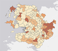
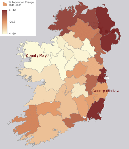
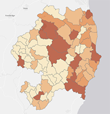
 ) to examine the % Land in Crops 1851;
that is, find the percentage of land in each county that was used
for agriculture. Set the sliders on the histogram to 45 and 20. Note that the average percentage is 32.6%.
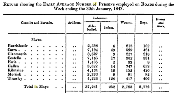
 )the Mayo data to show just the
electoral districts that are at least average. Next visit County
Wicklow (Bookmarks) and filter the population
densities there to show just those districts where the value is at
least as big as the County Mayo average. Describe the results and your
conclusions.